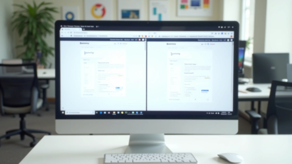
Language Switcher Design Patterns That Work
Three proven patterns for language switchers—flag icons, dropdown menus, and text links. When to use each and how to make them accessible.
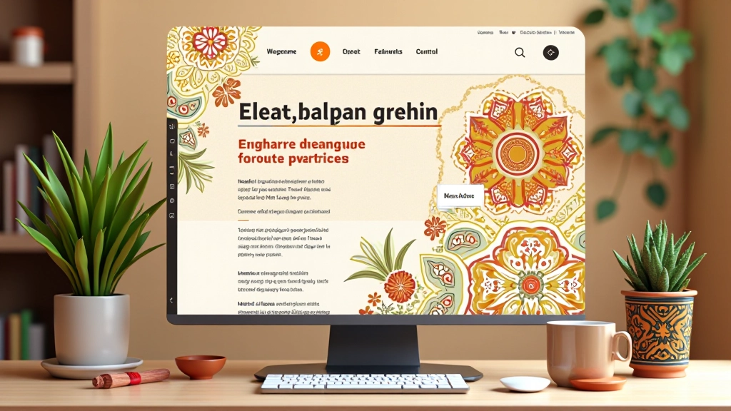
Read ArticleTranslation isn’t enough. How to adapt colors, imagery, and design patterns to resonate with Malaysian audiences while keeping your design cohesive.
You’ve translated your website into Malay. The buttons work. The navigation makes sense. But something feels off. The design that works beautifully in English somehow doesn’t feel right for Malaysian users. That’s because translation is just the beginning — real localization goes deeper.
Cultural adaptation means thinking about color symbolism, visual preferences, layout expectations, and imagery that resonates with your audience. It’s the difference between a website that technically works in another language and one that feels genuinely designed for that market. We’re talking about the details that Malaysian designers instinctively understand but English-first designers often miss.

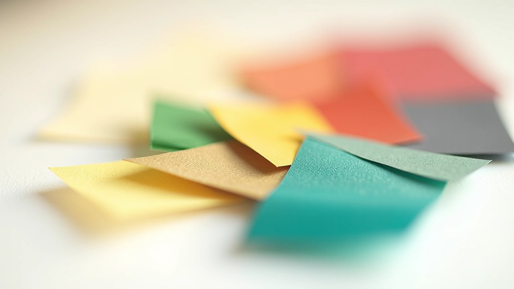
That red button that converts well in Western markets? It means something different here. Red’s powerful in Malaysia — it’s auspicious, celebratory, and tied to prosperity. But use too much and it feels aggressive. Green is calming and trustworthy. Yellow represents royalty and spirituality in Malay culture. These aren’t just preferences — they’re cultural signals your audience reads instantly.
The key isn’t copying traditional color schemes wholesale. It’s understanding the emotional weight. You don’t need to make your site look like a traditional batik pattern. Instead, respect how colors are perceived. A fintech app using gold accents will feel more premium to Malaysian users than the same app using bright blue. A healthcare site in green communicates trust faster than one in orange. These choices compound across every interaction.
Test your palette with real users from the market. Don’t assume. A designer in Kuala Lumpur will spot cultural color clashes that someone designing in London would miss entirely.
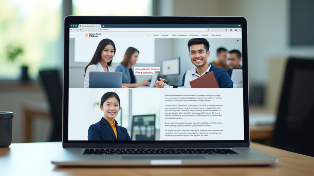
The stock photo of a blonde woman in a tech startup won’t land on a Malaysian site. It’s not about exclusion — it’s about recognition. When people see themselves represented in your design, they feel welcomed. They’re more likely to engage, trust your brand, and convert.
Use images featuring Malaysian faces, diverse ethnicities within Malaysia (Malay, Chinese, Indian, Indigenous communities), and settings that feel locally relevant. A photo of someone in a modern Kuala Lumpur office reads differently than someone in a generic glass building. A celebration showing lanterns and traditional elements signals cultural awareness. These details build trust faster than any tagline can.
Don’t overdo it though. Forced representation feels cheap. Use imagery authentically — if you’re building a local service, show local people. If you’re a global brand, show global diversity including Malaysian representation. The goal is genuine reflection, not performative inclusion.
Malaysian users expect different things from a layout than Western audiences. Here’s where it gets specific: reading direction is left-to-right in Malay (unlike Arabic), but visual weight distribution still differs. Information hierarchy, whitespace usage, and how elements relate to each other matter more than you’d think.
Western design trends toward minimalism — lots of whitespace, focus on one element at a time. Malaysian users often prefer richer layouts with more visual information density. This doesn’t mean cluttered. It means organized, but with more to explore. A landing page with three sections feels sparse to a Malaysian audience. Six well-organized sections feels complete.
Navigation patterns differ too. Top navigation with burger menu works universally now, but footer content gets more attention in Asian markets. Don’t bury important links in a collapse menu — make them visible. Social proof elements (testimonials, reviews, trust badges) perform better when more prominent. Contact information should be immediately accessible, not hidden behind multiple clicks.
Concrete techniques you can implement today
Take every color in your design system and research its cultural significance in Malaysia. Red, green, gold, white, black — each carries weight. Document what you find. You don’t need to change everything, but you’ll spot conflicts you didn’t know existed.
Don’t wait for a complete rebrand. Start adding Malaysian representation to new pages. When you redesign sections, use locally relevant imagery. Over time, your entire site will feel more authentic without a disruptive overhaul.
Add more content sections, but maintain clarity. Use cards, organized grids, and visual hierarchy. Malaysian users appreciate seeing more options upfront rather than clicking through multiple sparse pages.
Don’t hide your contact information. Display it clearly. Add trust badges, certifications, testimonials, and social proof higher on the page. Malaysian users want to know who they’re dealing with before they commit.
Run user testing sessions with Malaysian participants. Watch how they interact with your design. Ask about color choices, imagery, and layout decisions. They’ll tell you what feels right and what feels off. Trust their instincts — they live this culture daily.
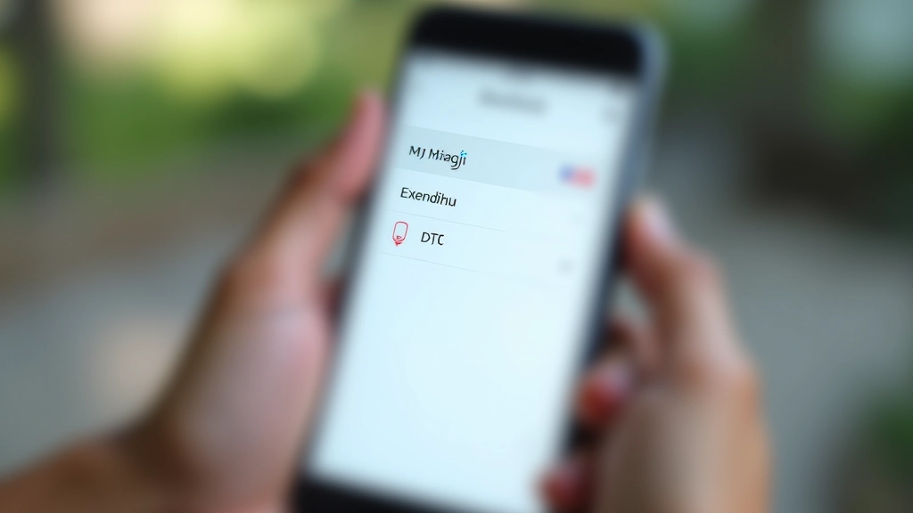
Your language switcher is a design decision, not just a technical feature. Where it sits, how it looks, and what it says shapes the user experience. Some sites hide it in a footer. Others make it prominent in the header. In Malaysia, making the language toggle visible signals respect for bilingual users — and you have plenty of them.
The best approach? Put your language switcher where users expect to find it (top-right or top-left of navigation) and make it obvious. Use clear labels — not just flag icons (flags can be ambiguous). “Malay” and “English” are explicit. A Malaysian flag with an English flag is less clear because Malaysia isn’t English-speaking; it’s just that English is widely understood.
When you switch languages, adapt more than text. Swap your imagery, adjust your color accents if needed, and restructure content for the language’s natural flow. Malay often requires different spacing than English. Don’t just translate — redesign for each language’s needs.
Cultural adaptation isn’t a one-time project. It’s a continuous conversation with your audience. Markets evolve. Preferences shift. New designers from the region bring fresh perspectives. What worked three years ago might feel dated now.
The sites that win in Malaysia aren’t the ones that just translate English designs. They’re the ones designed thoughtfully for Malaysian users from the start. They respect cultural signals. They show local faces. They understand how people here interact with digital products. That’s not extra work — that’s just good design.
Start small. Pick one area — color, imagery, or layout — and adapt it intentionally. Test it. Learn from your users. Then expand. Over time, you’ll build a site that doesn’t just work in Malay. It feels genuinely designed for Malaysia.
Ready to deepen your bilingual design knowledge?
Explore Language Switcher Patterns


This article provides general guidance on cultural adaptation in web design. Design preferences vary among individuals and regions — what resonates with one user may not with another. Cultural insights offered here are observations from design practice, not absolute rules. Always test your design with real users from your target market. User research and feedback should inform your design decisions more than any general principle. Every project is unique, and local context matters more than global trends.